Consulting Websites That Don't Suck: A Guide to Digital Makeovers
Dec 8, 2024
So, you’ve decided it’s time for a new website. Smart move.
Here’s why: 75% of customers judge a business’ credibility via their website.
As a consultant, trust is your currency.
And first impressions? They’re everything.
If your site is speaking to the wrong clients, or still rocking the same look it had years ago, you’re not just overdue for a refresh.
You’re risking potential clients clicking away before they even get to know you.
The question now is: what does a great consulting website actually look like?
In this guide, we’re talking about websites for independent and boutique consultants, breaking down the must-haves of a site that oozes credibility, builds trust and helps you hit your revenue goals. Plus, we’ll cover the common mistakes that could be costing you clients (and how to avoid them).
Quick reminder before we dive in: although design is important, a consulting website isn’t just about looking polished.
Best in class consultant websites make the right people stop scrolling, trust what they see and take action. Yours needs to communicate your expertise, connect with your audience and show them exactly why you’re worth their investment.
Let’s get into it.
Website pitfalls that scream ‘don’t hire me’
Your site might not be actively bad, but is it actively working for you?
Here are the most common pitfalls consulting websites fall into (even the ones designed by a pro) that stop them from validating leads and showcasing your expertise.
1. Photos that say nothing
You know the ones. Two strangers shaking hands in a boardroom or a ‘team photo’ that looks like it came free with a frame. They might look professional, but they’re not you.
Why it matters: 86% of people say authenticity influences whether they trust a brand.
How to fix it: ditch the generic stock photos and use real images of you, your team, process, or even behind-the-scenes shots. Clients want to see the consultant they’ll be working with, not a random model.
2. Copy that’s more sleep aid than sales tool
Nothing kills interest faster than an overwhelming wall of text filled with jargon. Your clients don’t want a dissertation, they want to know if you can solve their problem.
Why it matters: visitors to your website only read 20% of the page and heavy text makes them bounce fast.
How to fix it: keep it engaging, sharp and skimmable. Use headings, bullet points, storytelling techniques and plain language that speaks directly to your clients’ needs.
3. A value proposition that’s as clear as mud
Your business has evolved, but your value proposition hasn’t. If your homepage still reflects the generalist approach you started with, it’s underselling what you bring to the table…and leaving your ideal clients unconvinced.
Why it matters: if you’re speaking to everyone, you’re speaking to no one. Say hello to low time on page and high bounce rates.
How to fix it: refine your value proposition to reflect the specific audience you’re targeting now. Lead with clarity: who do you help, what do you help them achieve and why are you the best person to do it?
The IMPACT framework for consulting websites
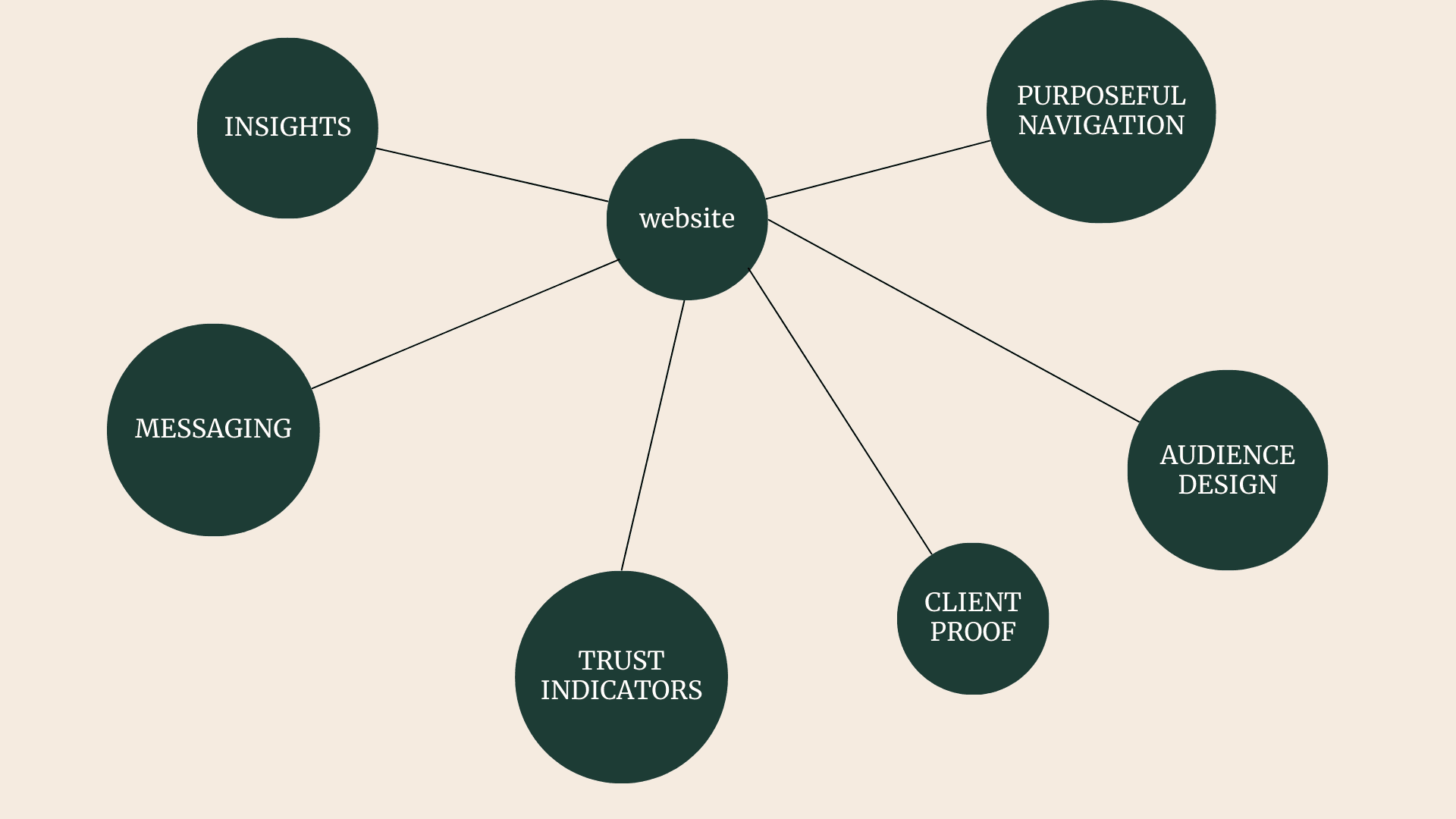
After writing copy for countless consulting websites, I’ve noticed the same six elements separate the ones that attract high-value clients from the ones that just...sit there.
The IMPACT framework is a useful, practical guide you can use to evaluate whether your site does exactly what it needs to: build trust, communicate value and convert the right people.

I: Insights
Every consulting website needs crystal clear positioning. Your hero statement and opening paragraph of copy on your homepage should tell your audience who you help, how and why they should care. Don’t just talk about you!
Pro tip: avoid unnecessary jargon but use language your audience recognises and relates to. If you’re talking to a law firm, use legal phrases intentionally.
M: Messaging that sells through story
Engage your readers with a hook and take them on a journey that guides them towards action. Your copy should connect with your readers emotionally (so they remember you) and intellectually.
Use storytelling techniques like developing a master narrative and picking a hero and villain.
P: Purposeful navigation
Every click should guide visitors toward working with you (but the default shouldn’t always be to book a call). Structure your site so users naturally flow from learning about you to contacting you. Each page should have a clear, singular goal.
A: Audience-centric design
Design isn’t just aesthetics, it’s strategy. Your site should reflect your audience’s preferences and expectations.
Work with a designer to choose layouts, visuals and fonts that appeal to your target clients. If you’re working with corporate leaders, aim for clean and professional. For creative industries, lean into bold and distinctive.
C: Client-focused proof
Your audience won’t just take your word for it, they’re looking for evidence. Your website should validate the good things they’ve heard about you.
Include case studies, testimonials and hard metrics that demonstrate how you’ve delivered results. Bonus points if you can highlight clients who are similar to your target audience.
T: Trust indicators
Even the most beautifully written and designed website needs updated credibility boosters. Sprinkle certifications, client logos, media mentions and awards across your site. These subtle signals help visitors feel confident you’re the expert for them.
Measuring website performance
Ok, so how do you know if your website is doing its job?
These are the key metrics to track when evaluating (or overhauling) your site:
Engagement
These show how effectively your site is holding visitors’ attention and can be found in Google Analytics 4:
Time on page: are visitors spending enough time to engage with your content?
Bounce rate: are visitors staying on your site or leaving immediately?
Pages per session: are visitors exploring your services, case studies or contact pages?
Conversion
These reveal how well your site is turning visitors into leads:
CTA click through rates: are visitors engaging with buttons like “Schedule a Call”?
Contact form submissions: how many enquiries are you receiving?
Event tracking: for example, downloads of PDFs or interactions with resources.
How it works in practice: a consulting website example
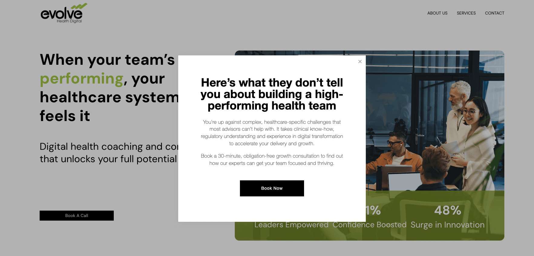
For a consulting website client in the healthcare sector, I applied the principles from this blog to their homepage and we’ve already got great results within 30 days:
47% increase in time on page
15% decrease in bounce rate
25% increase in CTA clicks
What did I do?
Before: their website lacked focus. Messaging was generic and outdated, services weren’t clearly defined and they didn’t showcase the high calibre of clients they work with, nor the transformational results achieved.
After:
A hero statement with impact: I reworked the value proposition and homepage to speak directly to their target audience of senior healthcare leaders.
Audience-focused messaging: copy now shows how their services solved real problems, not just what they offered.
Strategic calls-to-action: I added buttons and a pop-up that tell visitors exactly what to do next.

So, if your consulting website feels more like a digital relic than a revenue driver, it’s time for a change.
A great consulting website doesn’t just look good, it works hard. It shows your specific audience you understand their challenges, proves you can solve them better than anyone else and makes it easy for them to take the next step.
Whether it’s clarifying your value proposition, sharing insights that position you as an expert or creating calls-to-action that actually convert, the strategies in this guide will help you build a consulting website that attracts the right clients and drives real results.
Ready to prove your credibility and win higher value clients? I’ve written websites for 20+ consultants so I know what works. Get in touch for a zero-obligation chat today where I’ll give you some ideas and explain what working with me could help you achieve.


